Identity Design Packaging
Tin.
-
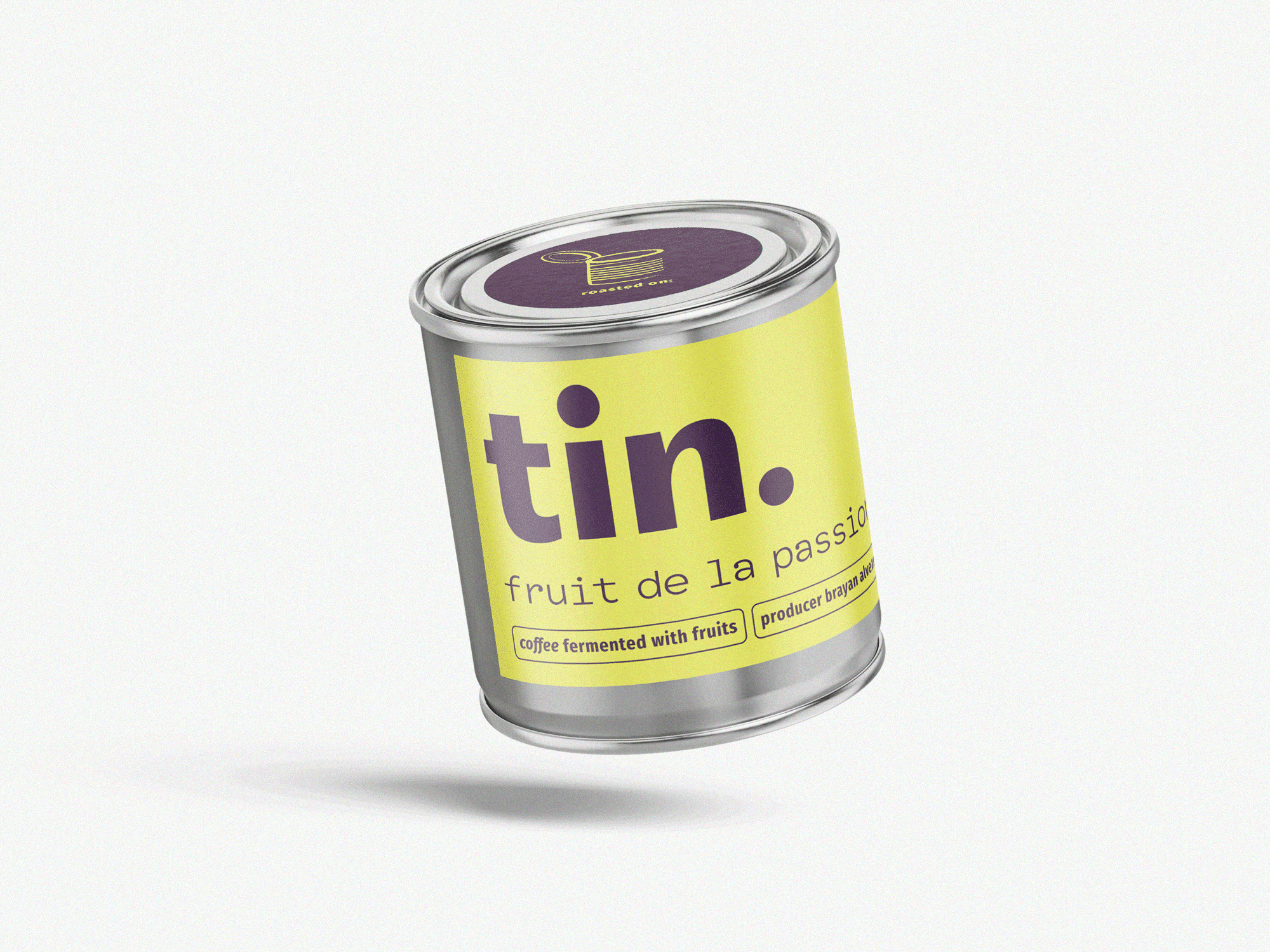
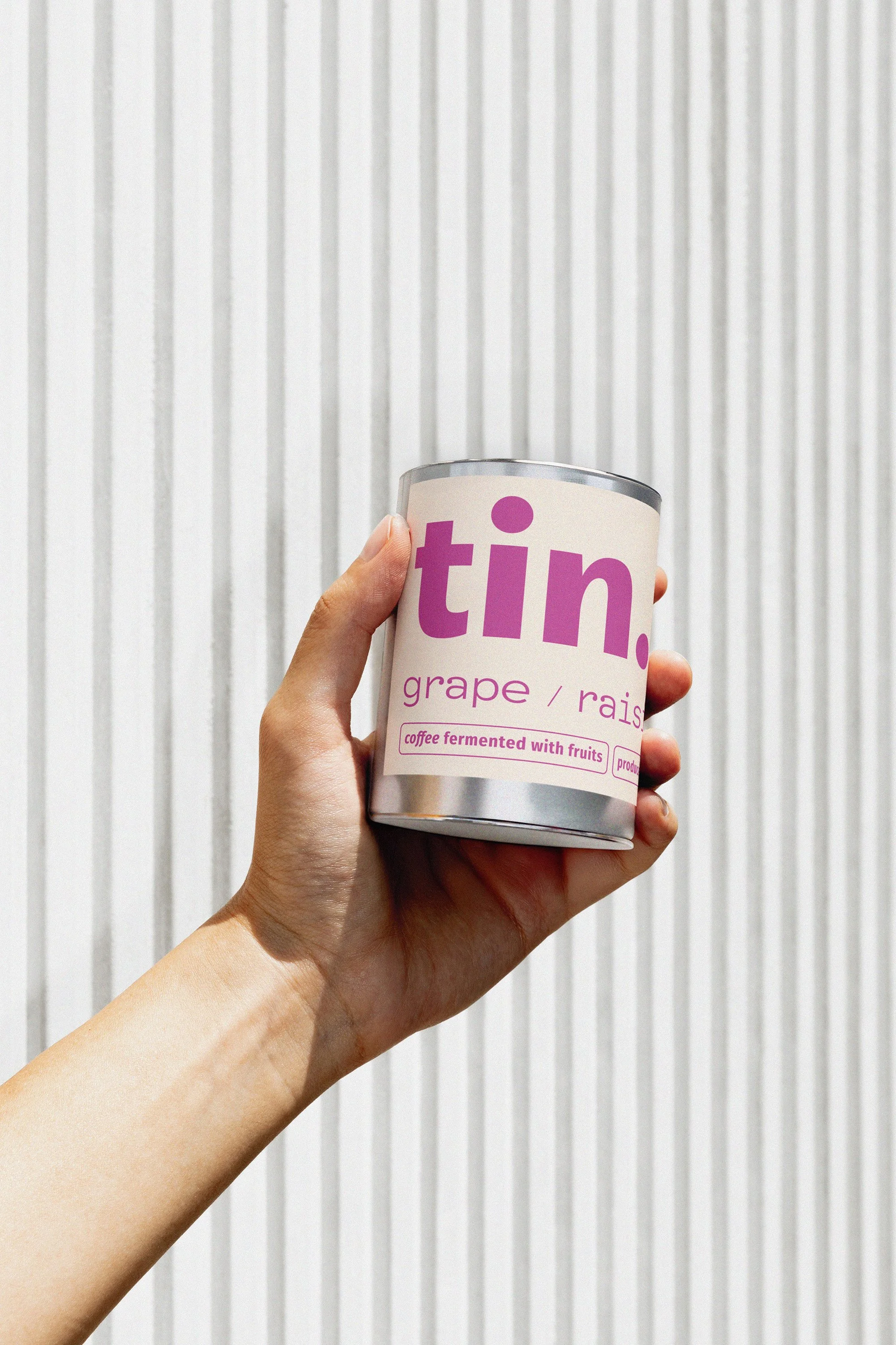
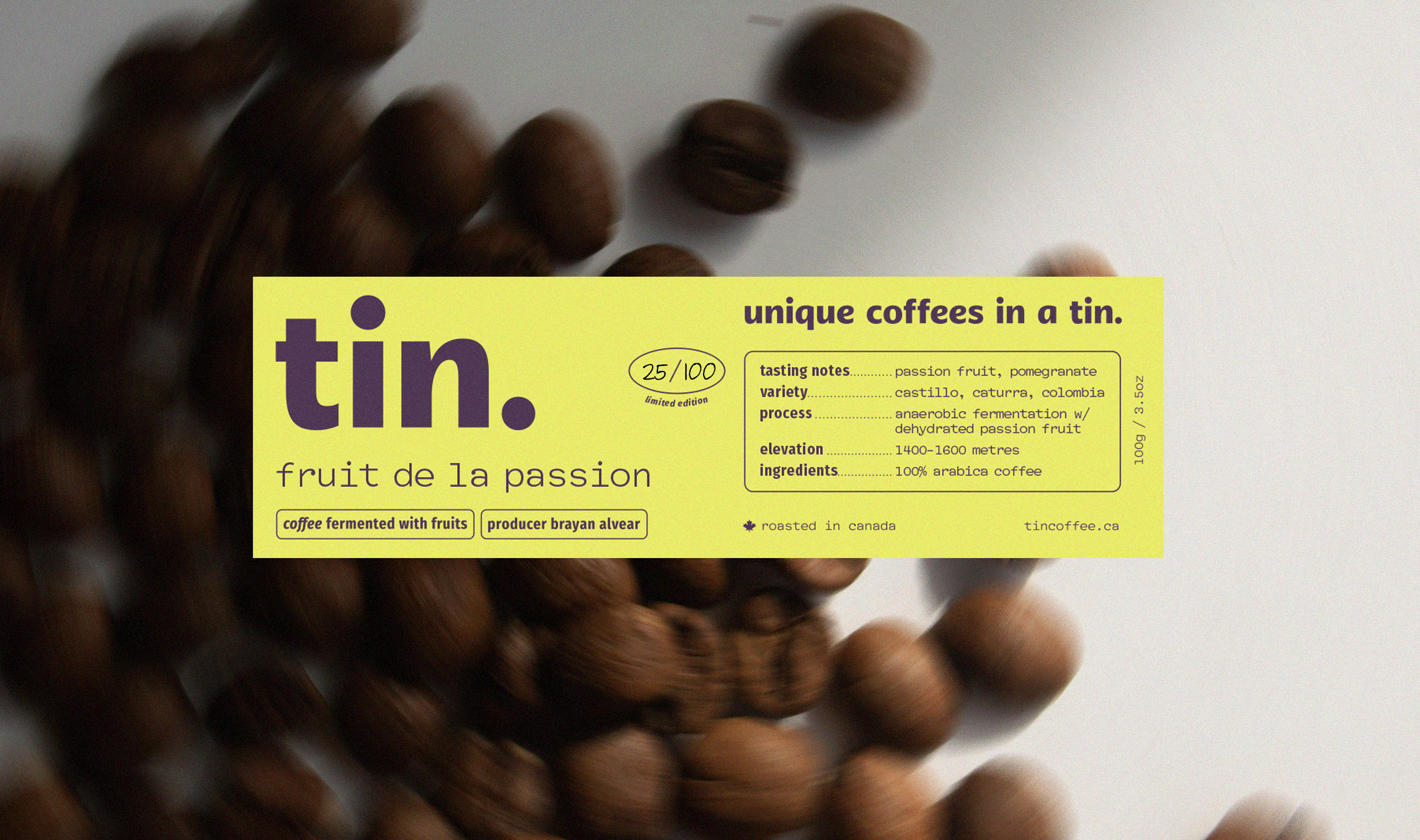
The client approached me to create a premium visual identity for tin., a small-batch coffee brand. The design needed to feel elegant and stand out from other wholesalers. With limited production runs, the brand should communicate exclusivity and quality. Sustainability was also a key consideration, with packaging designed for reuse beyond its original purpose.
-
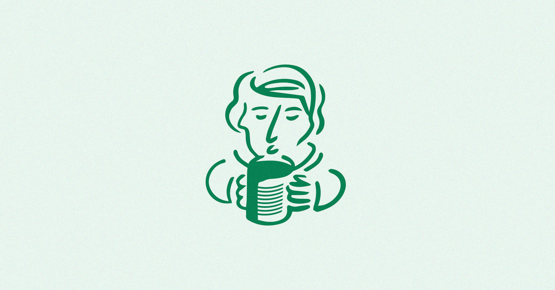
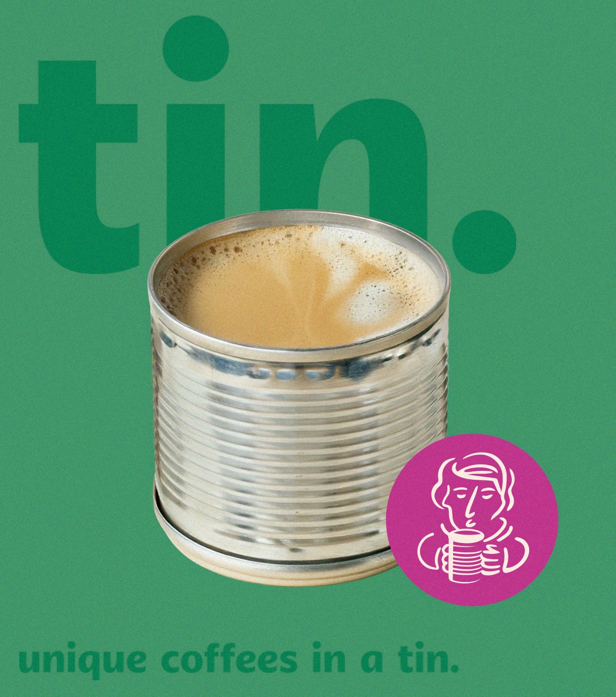
I developed a minimal yet sophisticated identity. A mix of earthy and eclectic colour palette paired with a clean layout ensures the strong shelf presence while remaining high-end. The name builds confidence, while playful secondary illustrations adds personality.
To support the brand’s sustainable ethos, the tin was designed as an object worth keeping; a simple design that would allow people to reuse the tin for other purposes and make a beautiful object stacked or filled with crayons or other household bits.