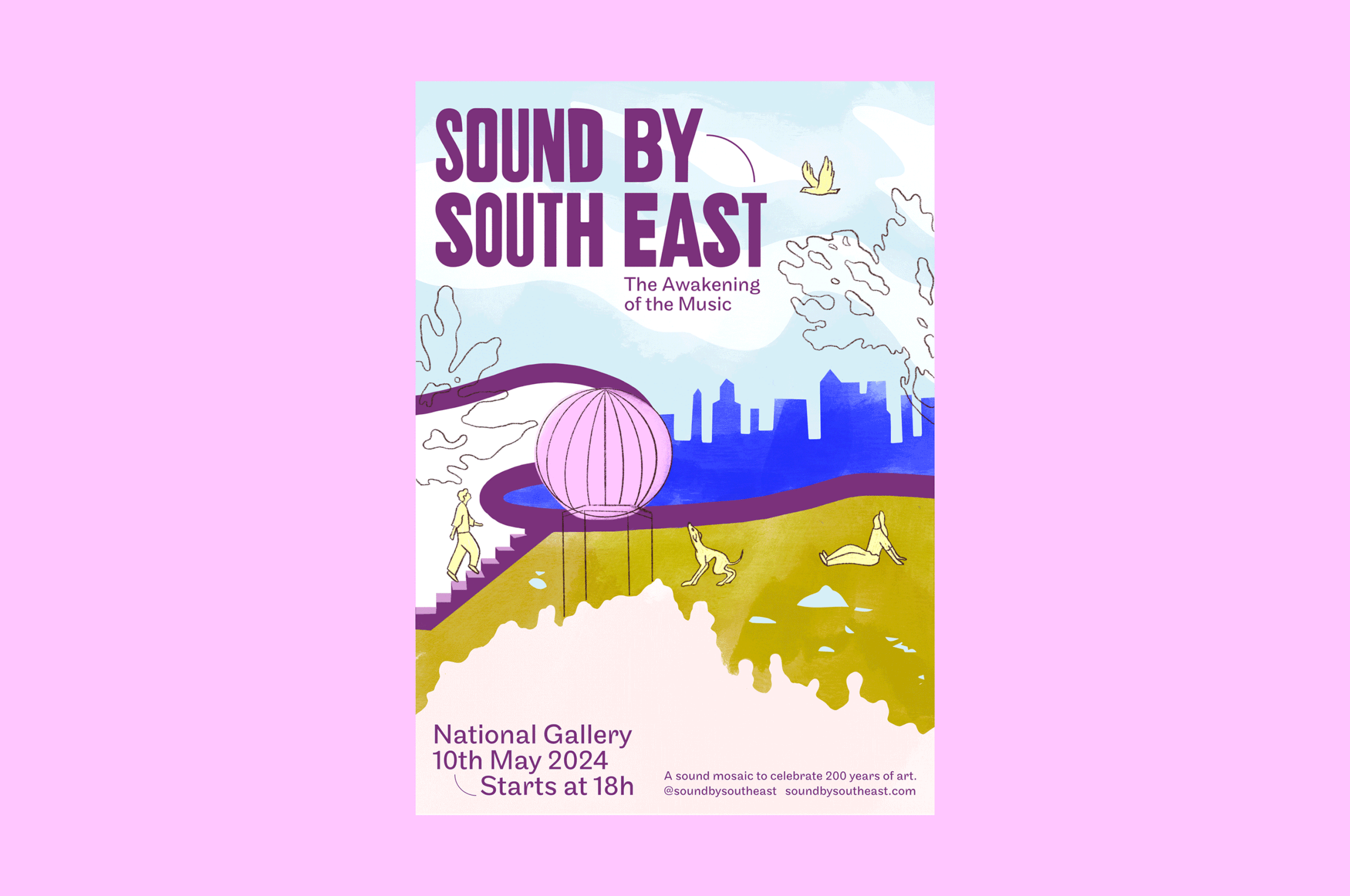
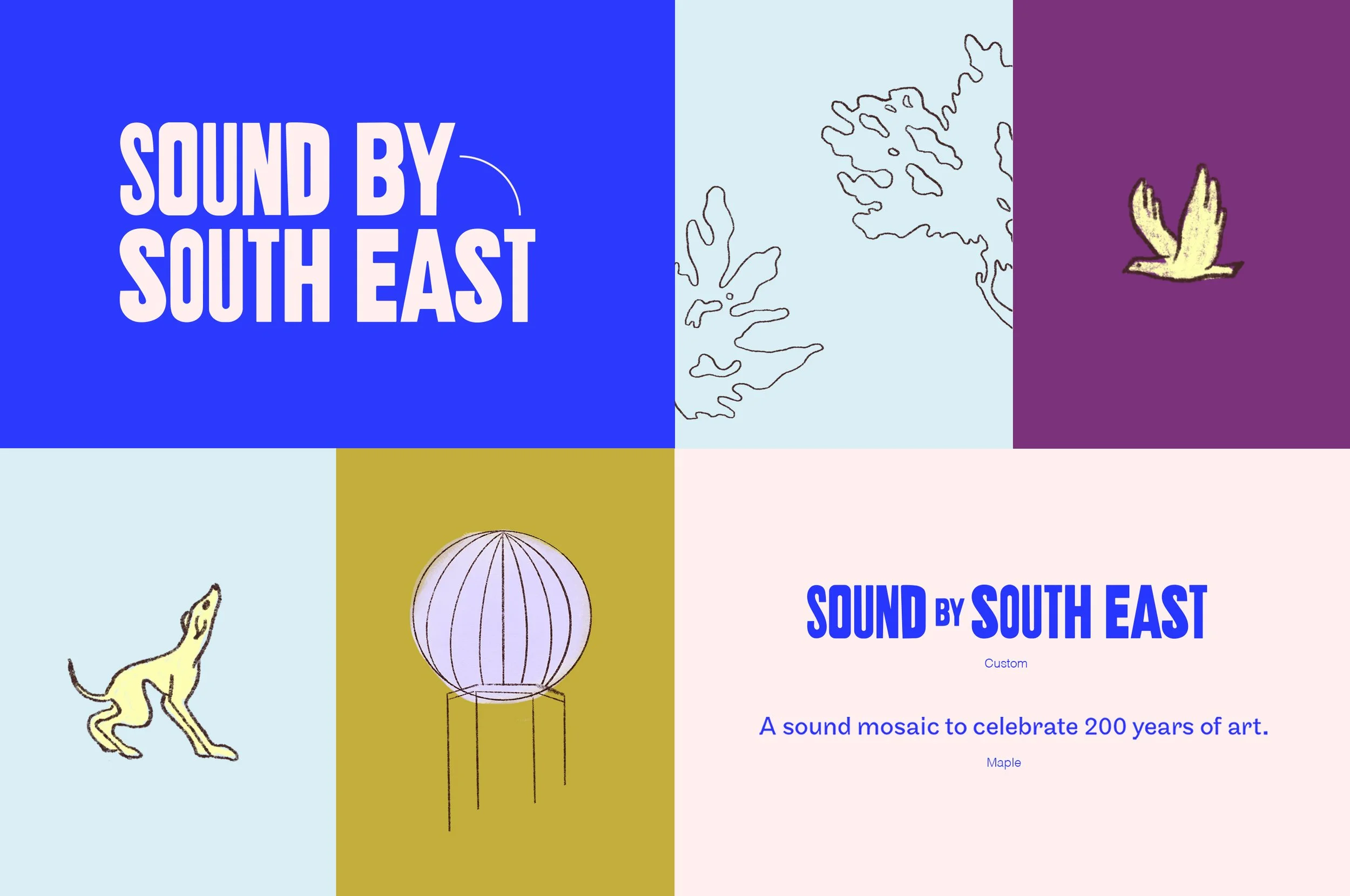
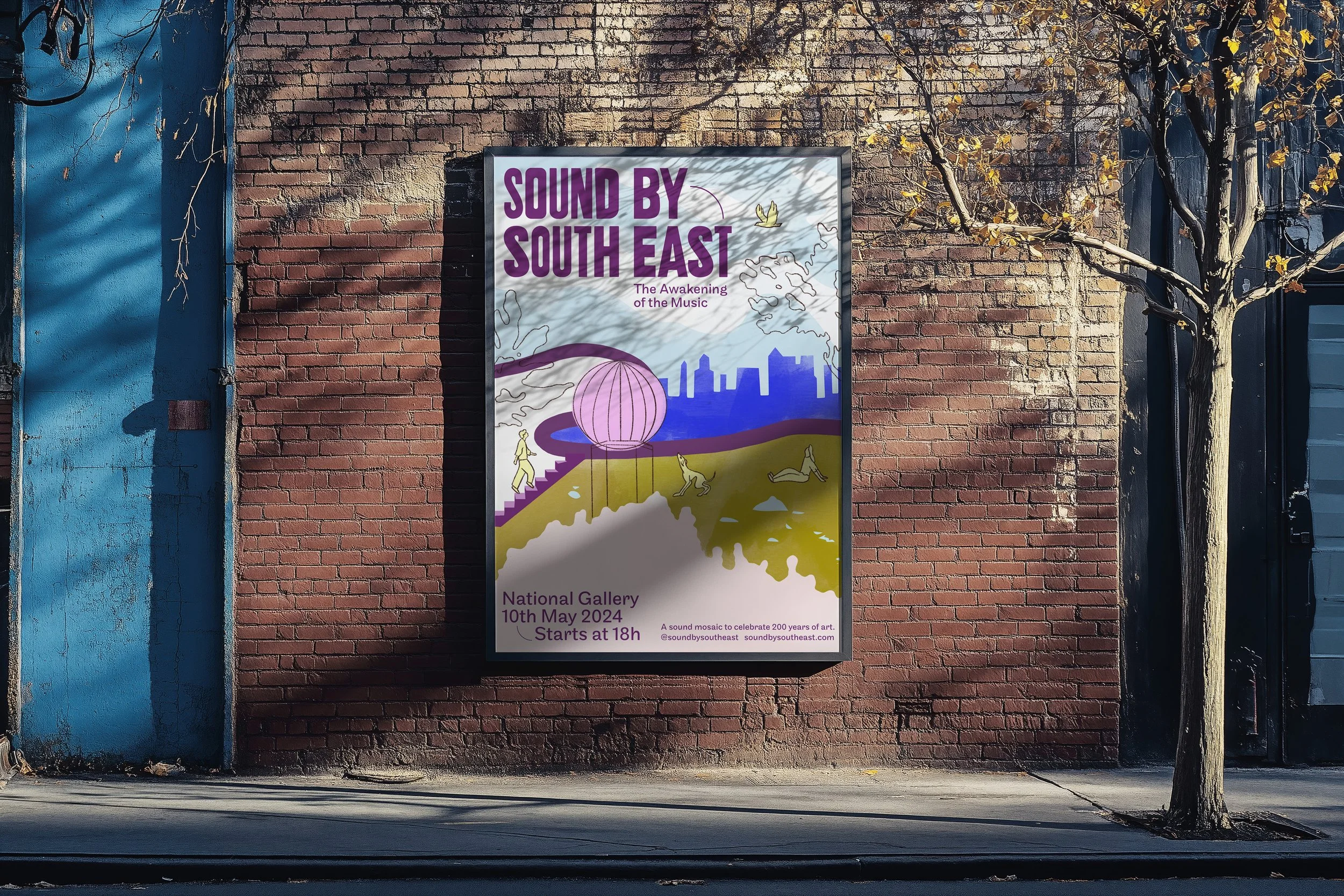
SSE, a South-East London-based music collective approached me to create their brand identity. The branding focussed on capturing their eclectic and whimsical spirit.
IdentityDesign Illustration Motion
Sound by South East
I crafted a unique logo and illustration using bold, vibrant colours and playful, hand-drawn elements. The challenge was to create a poster that works for both social media and print and featuring lively graphics and abstract London scenes, ensuring an eye-catching and cohesive visual identity that resonated with their audience.